Cloud White, Color of the Year — and Why Color Still Belongs at Home
/Each year, the Color of the Year sparks plenty of conversation in the design world.This year, it’s Cloud White — soft, light, and undeniably calming.
We love a good white. Truly. Whites like this can be beautiful, grounding, and incredibly useful when done well.
But there’s something else happening in homes right now that feels just as important. People are craving warmth. Comfort. Spaces that feel layered, lived-in, and personal. Homes that feel homey again. And that’s where color comes in.
White Isn’t the Problem — It’s the Balance
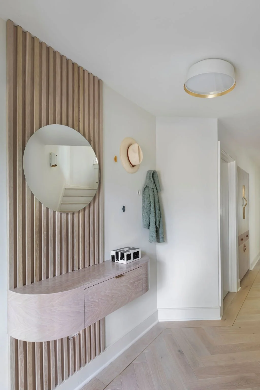
Cloud White works wonderfully as a backdrop. It reflects light, gives rooms room to breathe, and allows other elements to shine. It’s timeless for a reason, but we’re seeing more clients want spaces that feel less stark and more soulful. Rooms that feel collected rather than styled. Homes that don’t rely on one note to do all the work. Color whether bold or subtle brings depth. It brings softness. It brings life.
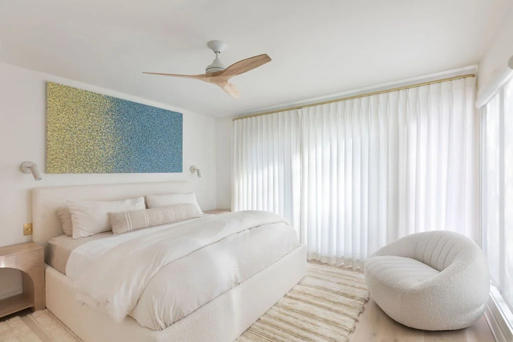
Spaces like this work because white is layered with texture, warmth, and pieces that feel personal — not because the palette follows a headline.
Color Has Always Been in Style
Color isn’t a trend. It never has been.
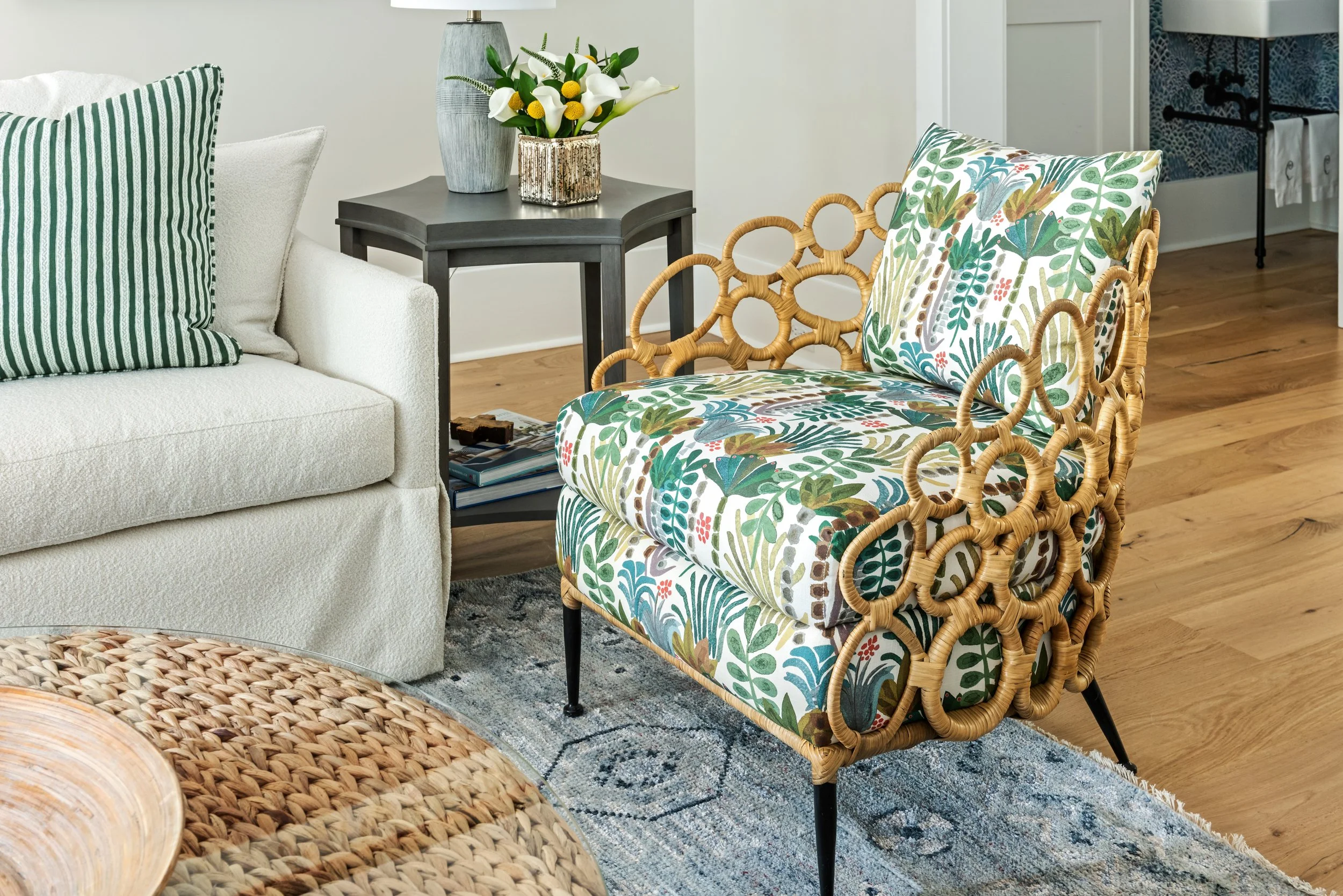
What changes is how we use it. Right now, color is showing up in quieter, cozier ways — muted blues, earthy greens, warm neutrals, textured plasters, layered textiles, and natural materials that invite you to slow down.
Sometimes it’s not about choosing “a color,” but choosing warmth, undertone, and mood. Those choices are what make a space feel personal.
The Only Design Rule That Really Matters
If there’s one piece of advice we’ll always stand behind, it’s this:
Design your home so it feels like your home — not a reflection of whatever is trending this year.
When a space supports how you live and what you love, it doesn’t go out of style. Trends fade. Headlines change. But a home that feels right to you will always feel current.
That might mean Cloud White on the walls, layered with warmth and character. Or it might mean embracing color more fully because it brings you joy. Both are valid. The key is intention.
Designing for Real Life
At Indigo Alley, we design for longevity, comfort, and real life — homes that feel welcoming, layered, and lived in. So yes, Cloud White may be having its moment but color has never left and it never will.