

Let's Talk Color!
/Embracing Bold Patterns and Bright Colors in Interior Design
In a world where minimalism often takes center stage, embracing bold patterns and bright colors can be a refreshing way to bring personality and energy into a space. Whether you're looking to make a dramatic statement or add playful accents, incorporating vibrant hues and striking designs can transform your home into a reflection of your unique style. Here’s how to do it effectively.

The Power of Color
Color has a profound impact on mood and atmosphere. While neutral tones create a sense of calm, bright colors like deep blues, rich reds, and sunny yellows can evoke excitement, creativity, and warmth. When used thoughtfully, these hues can add vibrancy without overwhelming a space.
To get started, consider:
Paint: One of the easiest and most transformative ways to introduce color into a space. A fresh coat of paint in a bold shade can dramatically shift the mood of a room. Consider color-blocking techniques, ombre effects, or even painted ceilings for a unique touch.
Furniture Pieces: A brightly colored sofa or statement chair can become the focal point of a living space.
Artwork and Accessories: Colorful artwork, rugs, and decorative pieces offer easy ways to introduce vibrancy without long-term commitment.
Mixing and Matching
Combining bold colors with striking patterns can seem daunting, but a few design principles can help maintain harmony:
Stick to a Color Palette: Choose a few key colors and use them consistently throughout the space to create cohesion.
Vary Scale: Mix large-scale patterns with smaller ones to avoid overwhelming the eye.
Balance with Neutrals: If bold colors and patterns dominate, balance them with neutral furniture or accessories to create visual rest.
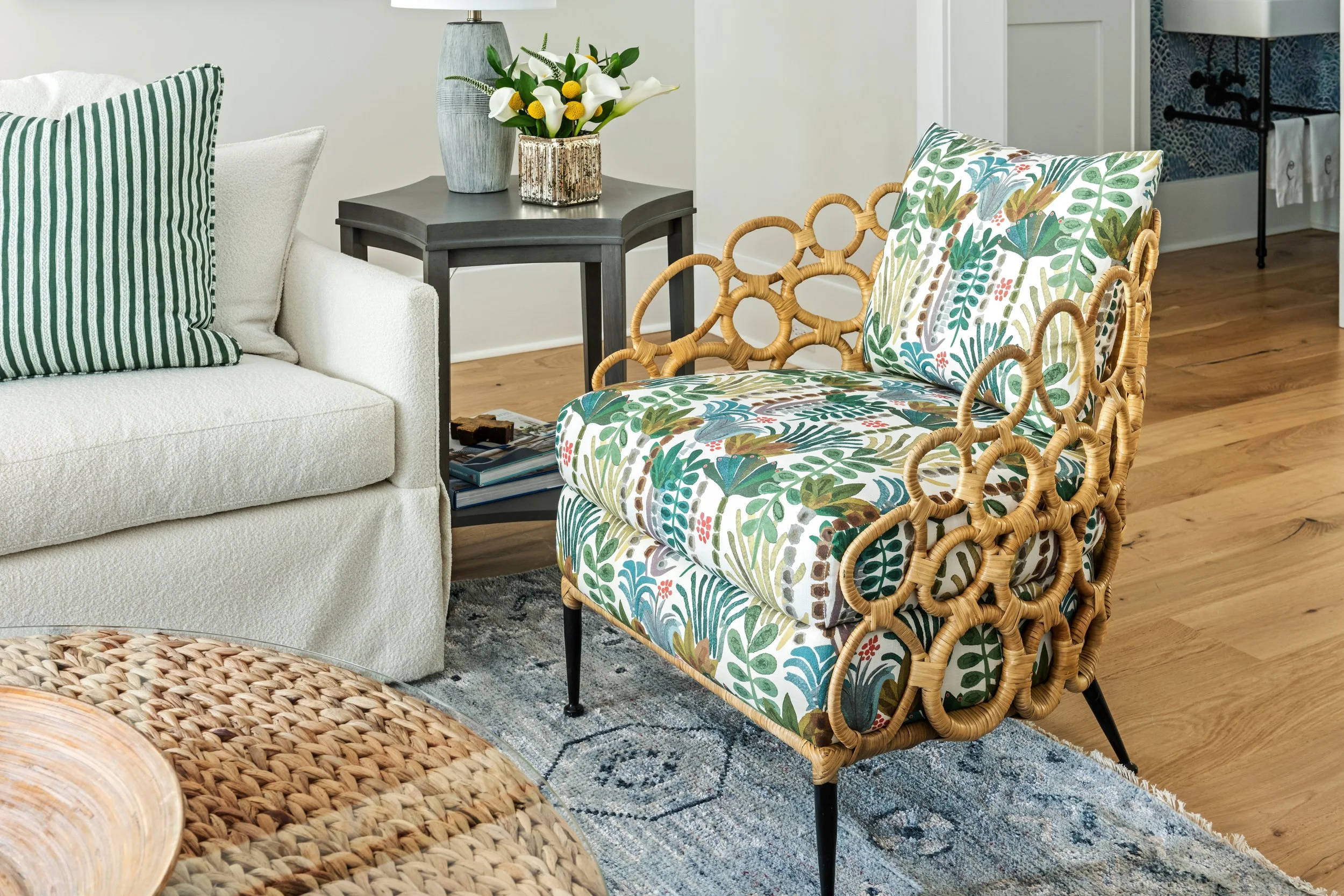
Playing with Patterns:
Patterns, whether geometric, floral, or abstract, add depth and interest to interiors. The key to successfully integrating patterns lies in balance and cohesion.
Some ways to incorporate patterns include:
Wallpaper: A bold, patterned wallpaper can transform a room, making it feel dynamic and lively.
Textiles: Mixing patterned throw pillows, curtains, and rugs can create a layered and cohesive look.
Tiling: Intricate tiles in kitchens or bathrooms add personality and artistic flair.
Mixing and Matching:
Combining bold colors with striking patterns can seem daunting, but a few design principles can help maintain harmony:
Stick to a Color Palette: Choose a few key colors and use them consistently throughout the space to create cohesion.
Vary Scale: Mix large-scale patterns with smaller ones to avoid overwhelming the eye.
Balance with Neutrals: If bold colors and patterns dominate, balance them with neutral furniture or accessories to create visual rest.
Making a Statement While Staying Timeless:

If you’re concerned about longevity, consider using bold colors and patterns in ways that can be easily updated. Statement pieces like patterned cushions and vibrant artwork allow you to experiment without a long-term commitment.
At Indigo Alley Interiors, we believe design can be playful and unique while still maintaining a sense of timelessness. Whether you’re ready for a complete transformation or just want to dip your toes into bold design, our expert team is here to guide you every step of the way.
Are you ready to embrace the bold? Contact us today to start your journey toward a more vibrant and expressive home!


